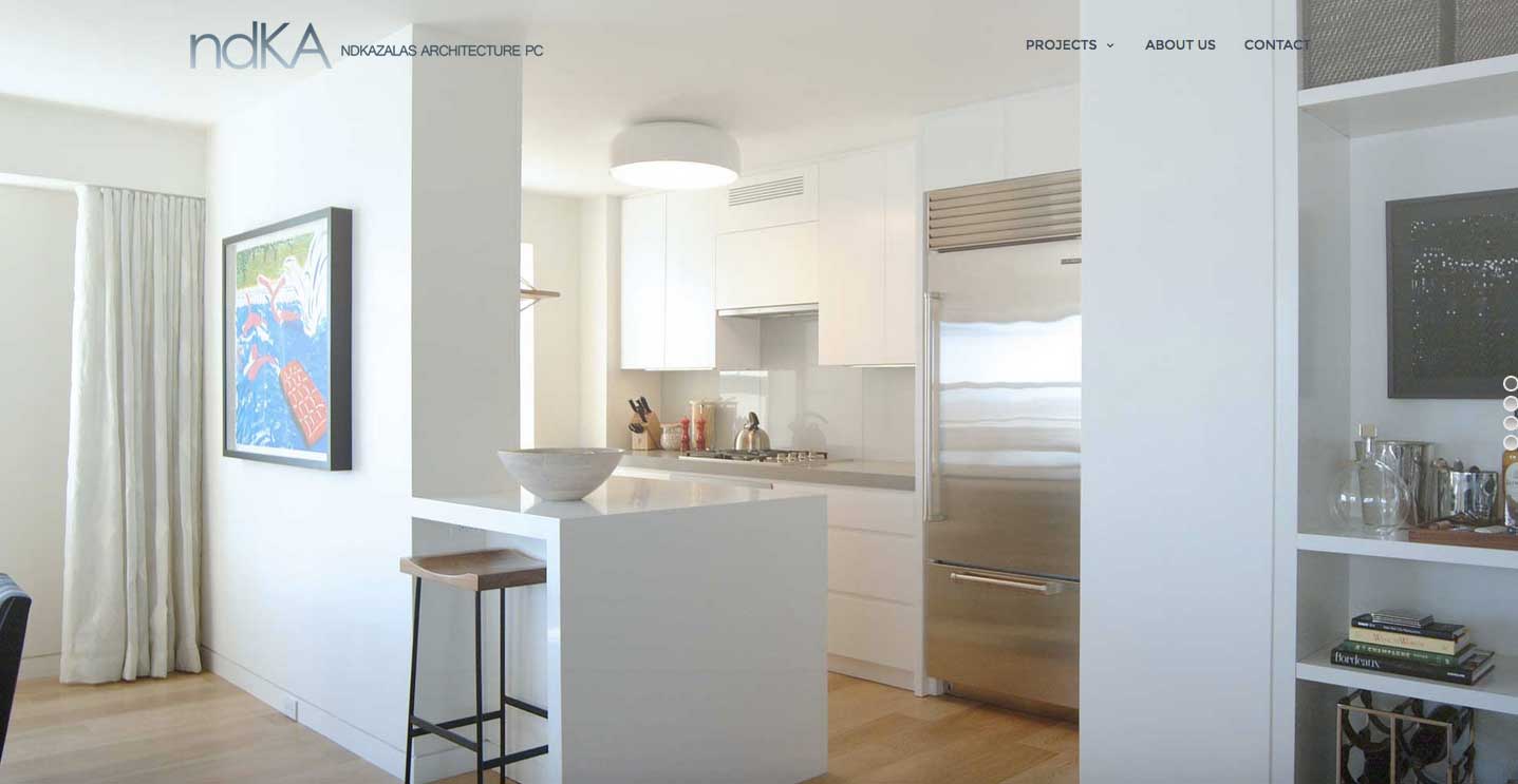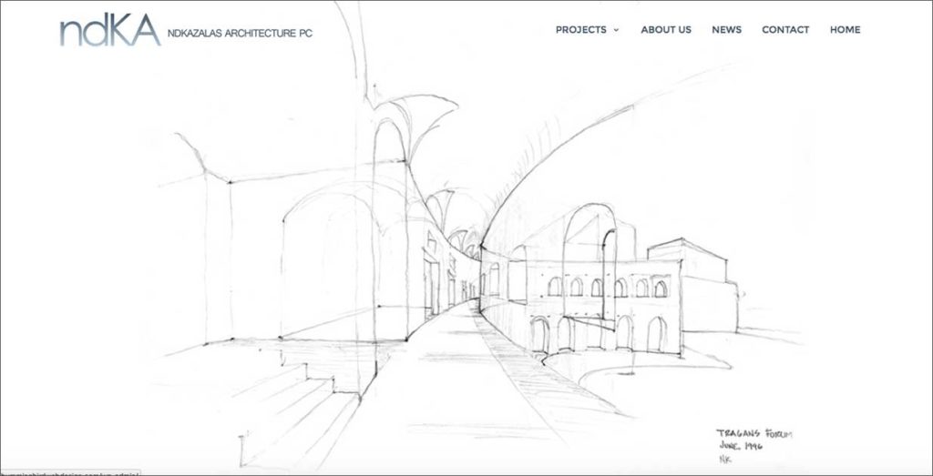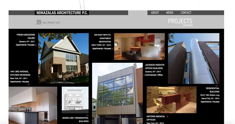
NDKazalas Architecture P.C contracted us for a redesign of the current website. It was a no-brainer from the start. The best approach was to design the website with minimal lines and color. Our goal was to display the portfolio free of distractions so to allow the work to stand on its own. The homepage holds the most impact because at first glance, as a web designer, we know we only have 3 seconds to make an impression. Knowing this, we placed a slide show on the homepage as a backdrop for the transparent header. The logo lives harmoniously with a simple navigation menu. The effect is streamline, bold and very visual. The portfolio too is displayed in its most simple form.
3 reasons we love this new build:
-
simple
-
modern
-
and its WordPress
and yes, it looks and performs great on mobile devices!
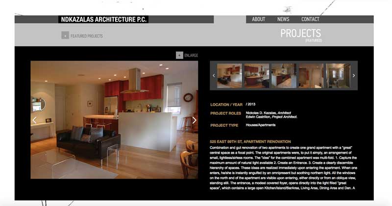
See 3 “before” screenshots of the old website.


Leave A Comment